With this command you can create single or multi-line and multi-language texts for the labeling of objects. The leader can be formatted in various ways, for example with a frame or symbol.
Input request
Specify starting point of the leader line or [?]:
Use the mouse or enter coordinates to specify the starting point of the leader line.
Specify next point or [Back/?]:
Use the mouse or enter coordinates to specify the next point of the leader line (kink point).
You can repeat the last input request with the option Back. Enter ENTER to write a text on the leader. A dialog box opens for this.
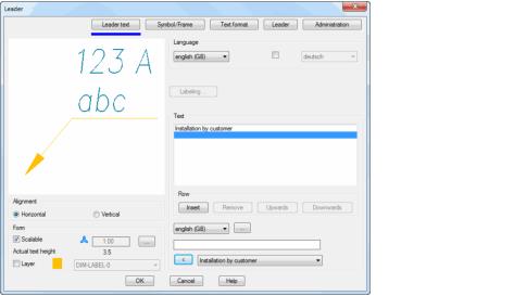
Dialog box Leader
db_ath_leader
The dialog box contains the register buttons Leader text, Symbol/frame, Text format, Leader and manager. The text and symbol properties are object specific; the manager is the same for all objects. You will find a detailed description of the functions of the manager in the Chapter Management of objects.
Dialog box section Alignment
Horizontal Aligns the leader text horizontally so that it is legible from the front.
Vertical Aligns the leader text vertically so that it is legible from the right.
Dialog box section Display
Scalable Switches the scaling feature of leaders on or off. You can change the current scale factor in the input field.
Leaders with several scales can be aligned differently in different scales.
Actual text height Specifies the actual text height. This is calculated from the current text height and the scale factor.
Layer Activates the layer replacement. If you activate the tick box, you can change the layer set as standard.
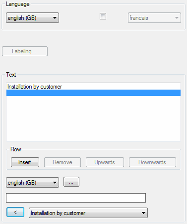
Register button Leader text
db_ath_leader_text
Dialog box section Language
First language Defines the first language of the leader text.
Second language Defines the second language of the leader text. The tick box must be activated to display the second language.
Labeling Opens the Dialog box Label, where you can adapt the label setting of automatically labeled objects. You will find further information in the Chapter Labeling.
Dialog box section Text
Preview for first language Displays the leader text of the first language. Here you can mark texts for further editing.
Dialog box section Row
Insert Inserts a new text row above the marked one. Enter the text in the input line.
Remove Removes the marked text line.
Upwards Moves the marked text one row upwards.
Downwards Moves the marked text one row downwards.
Language selection Selects the language for the text to be entered.
[...] Opens the Dialog box Label, where you can conveniently manage multi-language texts. You will find further information in the Chapter Label.
Text input Defines the text in the chosen language. If you press Enter after the text input, the text is transferred into the preview box. The input line is immediately released for the entry of further texts.
[<] and pick list The pick list displays multilingual standard texts from the text database ath_user.rsx. Select a text and click the button [<] to insert the text into the active row. You will find further information about labeling objects in the Chapter Multilingual standard texts.
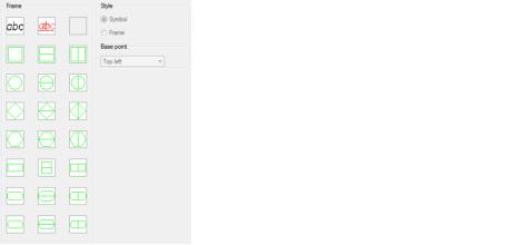
Register button Symbol/frame
db_ath_leader_symbol
Dialog box section Frame
Defines the selected frame as border for the leader text. The selected frame is displayed directly in the dynamic preview.
Dialog box section Style
Symbol Defines the border of the leader text as a symbol. Symbols enclose either the first or first two constituents of the leader text.
With leaders with an arrow, texts are not displayed from the third text constituent.
Frame Defines the border of the leader text as a frame. A frame always encloses the complete leader text. The Frame option is only available for single-line symbols.
Dialog box section Base point
Defines the base point of the leader. This function is not available for leaders with a leader line.
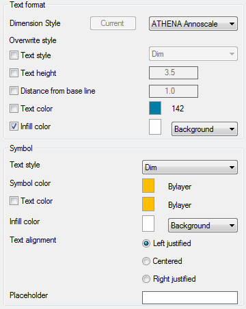
Register button Text format
db_ath_leader_textformat
Dialog box section Text format
For leader texts the settings of the current dimension style are used as standard. Here, you can overwrite single style settings.
Dimension style Here you can select the dimension style for the leader line.
Current Sets the current dimension style of the drawing for the leader line. The button is only active when the current dimension style is not set.
Text style Switches in replacement of the text style. If you activate this tick box, you can select a text style from the list.
Text height Switches in replacement of the text height. When you activate this tick box, you can define a new text height in the input field.
The text height defined here is multiplied by the dimension scale factor.
Distance from base line Switches in replacement of the distance between the text and the base line. When you activate this tick box, you can define a new distance in the input field.
The distance defined here is multiplied by the dimension scale factor.
Text color Switches in replacement of the text color. When you activate this tick box, you can define a new text color by clicking the color button.
Infill color Switches in replacement of the infill color of the leader text. When you activate this tick box, you can define a new infill color by clicking the color button.
Dialog box section Symbol
Text style Switches on replacement of the symbol text style. If you activate this tick box, you can select a text style from the list.
Symbol color Switches on replacement of the symbol. When you activate this tick box, you can define a new symbol color by clicking the color button.
Infill color Switches on replacement of the infill color of the symbol text. When you activate this tick box, you can define a new infill color by clicking the color button. For color changes the dialog box Color is started. You will find further information on this subject in the AutoCAD documentation.
Text alignment Changes the text alignment. You can align text left justified, centered and right justified. The text alignment acts on texts in frames as well as on texts arranged below symbols. As standard, texts in symbols are aligned centered.
Placeholder Defines a text as placeholder for the symbol width. With the placeholder you can influence the width of symbols. In this way it is possible to design symbols with different widths of text with uniform width.
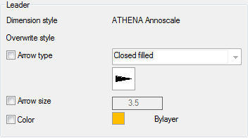
Register button Leader
db_ath_leader_line
For leader lines the settings of the current dimension style are used as standard. Here, you can overwrite single style settings.
Dimension style Displays the dimension style used for information.
Arrow tip Switches in replacement of the arrow tip. If you activate this tick box, you can select a new arrow type from the list.
Arrow size Switches on replacement of the arrow size. When you activate this tick box, you can define an arrow size in the input field.
Color Switches on replacement of the arrow color. When you activate this tick box, you can define a new arrow color by clicking the color button. For color changes the dialog box Color is started. You will find further information on this subject in the AutoCAD documentation.
Note
• As standard, the leader line is drawn on the current dimension layer. You will find information on layer assignment in the Chapter Layer.
• When stretching leaders with an arrow, the leader arrow always adapts to the new direction.
• You can edit leader texts with Modify object or by double clicking.